
Super Suite
Get all extensions for one suite price
Design Extender
Design and create unlimited websites
Data Bridge
Develop database-driven websites
eCart
Build a responsive shopping cart + checkout
MySQLi Server Behaviors
Generate streamlined MySQLi
Free PayPal Toolkit
Paypal, PayPal Credit, and Skype
Help
 LICENSE TO BUILD UNLIMITED WEB SITES 15-DAY MONEY BACK GUARANTEE FREE {outstanding} TECHNICAL SUPPORT
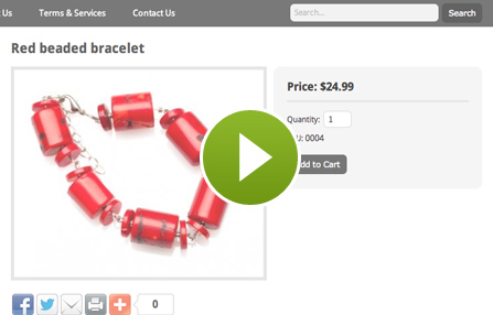
Greatly accelerate your development in Dreamweaver with our collection of extensions. Create standardized CSS layouts, database-driven pages, content management systems, shopping carts and more. Build unlimited websites; receive free technical support, plus a consultation to get started.
User-friendly wizards guide you through building database-driven web pages, login/registration/tiered access systems, web forms, automated emails, dynamic dropdowns, Flash charts and more.

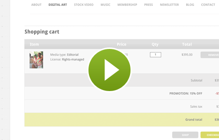
User-friendly wizards guide you through building a responsive shopping cart and checkout system in Dreamweaver. Configure shipping rules, tax rules and coupons from a wizard.
User-friendly wizards guide you through CSS template development, creating your websites, adding content management, social media buttons, Google maps and more.

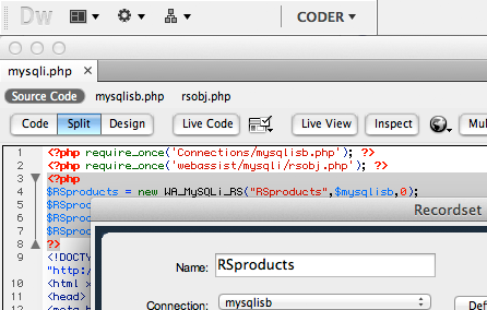
With MySQL deprecated, this extension will help you continue building PHP websites. Create MySQLi recordsets, repeat regions and generate MySQLi code.
Quickly add PayPal buttons and Bill Me Later® to your websites in Dreamweaver. Other features include adding Google Search or Skype buttons, and accessing Adobe Kuler within Dreamweaver.


Register for upcoming webinars or browse our in-depth training sessions on relevant web development topics. Webinars are led by WebAssist President, Ray Borduin.
Your friends over here at WebAssist! These Dreamweaver extensions will assist you in building unlimited, custom websites.
These out-of-the-box solutions provide you proven, tested applications that can be up and running now. Build a store, a gallery, or a web-based email solution.
©1999-2026 WebAssist.com Corporation. All rights reserved and all that jazz.

Account or customer service questions?
Please user our contact form.
Need technical support?
Please visit support to ask a question