Getting Started With Validation Tooltips For Spry
Validation Tooltips for Spry allows you to update your Spry validation error messages to display as tooltips. Apply this extension's functionality to any form that contains Spry validation.
This guide will show you how to modify the Spry validation on your current form to a more attractive Spry validation too tip.
This guide will show you how to modify the Spry validation on your current form to a more attractive Spry validation too tip.
Updating your validations
With Validation Tooltips for Spry already installed and the form that contains your Spry validation open in Dreamweaver, you can launch the interface to update your validation error messages.General tab
- From the WebAssist menu, choose Validation Tooltips for Spry.
- From the Preset menu, choose the preset you would like to use for your tooltips.
Each preset can be customized further from the other two tabs in this interface.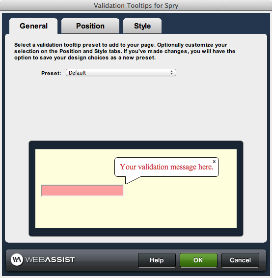
- Once you have selected the Preset you would like to start with, select the Position tab to modify the positioning of the tooltip.
Position tab
- Customizing the positioning of your tooltips using the options provided on this tab.
- Tip placement: Choose the placement of the tooltip in relation to the field.
- Tip offset: Specify the number of pixels you wish to offset the tip of the arrow.
- Arrow pointer: Choose the desired appearance for the arrow pointer.
- Arrow offset: Specify the desired number of pixels you wish to offset the arrow.
- Arrow height: Specify the desired height in pixels for the arrow.
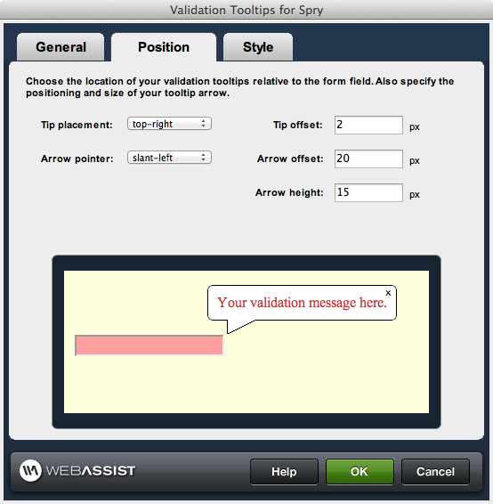
- Once you have configured the position for your tooltips, select the Style tab to modify the appearance.
Style tab
- Customize the appearance of your tooltips from the options available.
- Opacity: Specify the desired opacity level for the tooltip.
- Text color: Specify the desired text color to be used for the tooltip.
- Background color: Specify the desired background color for the tooltip.
- Border color: Specify the desired border color for the tooltip.
- Close button color: Specify the desired color for the close button.
- Border width: Specify the desired width for the border.
- Border roundness: Specify the desired degree of roundedness you wish to apply to the corners
The rounded corners affect may not display properly within the Preview window on Windows machines. When displayed in a browser, the roundedness will display as desired.
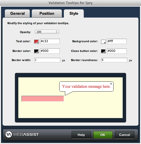
- When you are ready, click OK to update your form's validation error messages with the tooltips you have designed.