Type
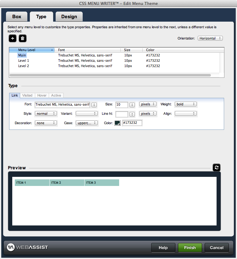
Menu Level control
Selecting a menu component within the control enables the corresponding property controls immediately below it, allowing you to configure the properties of that component directly.
Add: Adds an additional menu level to the Menu Level Control, allowing you to customize the design for menu items at any level.
Delete: Deletes the selected level from the Menu Level Control. Design aspects for that level will be removed from the menu.
Orientation: Allows you to choose Horizontal or Vertical for your navigation menu.
Type
This section controls the text properties, as described below the figure.- Link: Applies to links that have not yet been visited.
- Visited: Applies to a link once it has been visited by the user
- Hover: Applies to an element while the user designates it with the cursor.
- Active: Applies to an element when activated by a user. For example, between when the user presses the mouse button and releases it.
Preview
The Preview pane displays a representation of the menu's design based on the configuration options you have specified. The preview area within the 3-tab interface displays placeholder text instead of the actual text for your menu items.
Click once on the preview area to display the menu within your default browser. From the Design interface, your preview will only contain placeholder text.
After making any changes to your design, click Refresh to view those changes in the preview.