Box
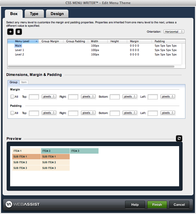
Menu Level control
Selecting a menu component within the control enables the corresponding property controls immediately below it, allowing you to configure the properties of that component directly.
Add: Adds an additional menu level to the Menu Level Control, allowing you to customize the design for menu items at any level.
Delete: Deletes the selected level from the Menu Level Control. Design aspects for that level will be removed from the menu.
Orientation: Allows you to choose Horizontal or Vertical for your navigation menu.Dimensions, Margin & Padding
This section controls the width and height and margin and padding for the menu components.
- Group: Allows you to specify margin and padding settings for an entire level.
- Item: Allows you to specify dimensions, margin and padding settings that will apply to the individual elements within a level.
- Margin: The additional space allocated outside of a menu component between that component and any others.
- Padding: The additional space allocated inside of a menu component between the border of that component.
- Width: Specify the width and select the units (if applicable) for the selected menu component. If a preset design is selected on the Menu tab, the width may already be defined.
- Height: Specify the height and select the units (if applicable) for the selected menu component.
Options for specifying the Margin and Padding attributes are identical, and are detailed as follows:
- All: When selected, sets the same value for all sides of the component using the Top entry.
- Top: Specify the top margin and select the units (if applicable) for the selected component.
- Right: Specify the right margin and select the units (if applicable) for the selected menu component.
- Bottom: Specify the bottom margin and select the units (if applicable) for the selected menu component.
- Left: Specify the left margin and select the units (if applicable) for the selected menu component.
Preview
The Preview pane displays a representation of the menu's design based on the configuration options you have specified. The preview area within the 3-tab interface displays placeholder text instead of the actual text for your menu items.
Click once on the preview area to display the menu within your default browser. From the Design interface, your preview will only contain placeholder text.
After making any changes to your design, click Refresh to view those changes in the preview.